核密度估計
核密度估計是使用核函數\(K(u)\)來估計未知機率密度函數的過程。直方圖計算在一定範圍內(稍微任意)的資料點數量,而核密度估計是一個函數,定義為每個資料點上核函數的總和。核函數通常具有以下屬性:
對稱性,使得 \(K(u) = K(-u)\)。
正規化,使得 \(\int_{-\infty}^{\infty} K(u) \ du = 1\)。
單調遞減,使得當 \(u > 0\) 時,\(K'(u) < 0\)。
期望值等於零,使得 \(\mathrm{E}[K] = 0\)。
有關核密度估計的更多資訊,請參閱維基百科 - 核密度估計。
單變數核密度估計器在 sm.nonparametric.KDEUnivariate 中實現。在此範例中,我們將展示以下內容:
基本用法,如何擬合估計器。
使用
bw參數調整核頻寬的效果。使用
kernel參數可用的各種核函數。
[1]:
%matplotlib inline
import numpy as np
from scipy import stats
import statsmodels.api as sm
import matplotlib.pyplot as plt
from statsmodels.distributions.mixture_rvs import mixture_rvs
單變數範例
[2]:
np.random.seed(12345) # Seed the random number generator for reproducible results
我們建立一個雙峰分佈:兩個位置在 -1 和 1 的常態分佈的混合。
[3]:
# Location, scale and weight for the two distributions
dist1_loc, dist1_scale, weight1 = -1, 0.5, 0.25
dist2_loc, dist2_scale, weight2 = 1, 0.5, 0.75

# Sample from a mixture of distributions
obs_dist = mixture_rvs(
    prob=[weight1, weight2],
    size=250,
    dist=[stats.norm, stats.norm],
    kwargs=(
        dict(loc=dist1_loc, scale=dist1_scale),
        dict(loc=dist2_loc, scale=dist2_scale),
    ),
)
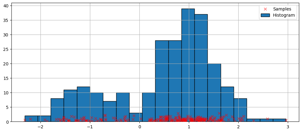
最簡單的密度估計非參數技術是直方圖。
[4]:
fig = plt.figure(figsize=(12, 5))
ax = fig.add_subplot(111)

# Scatter plot of data samples and histogram
ax.scatter(
    obs_dist,
    np.abs(np.random.randn(obs_dist.size)),
    zorder=15,
    color="red",
    marker="x",
    alpha=0.5,
    label="Samples",
)
lines = ax.hist(obs_dist, bins=20, edgecolor="k", label="Histogram")

ax.legend(loc="best")
ax.grid(True, zorder=-5)
使用預設參數進行擬合
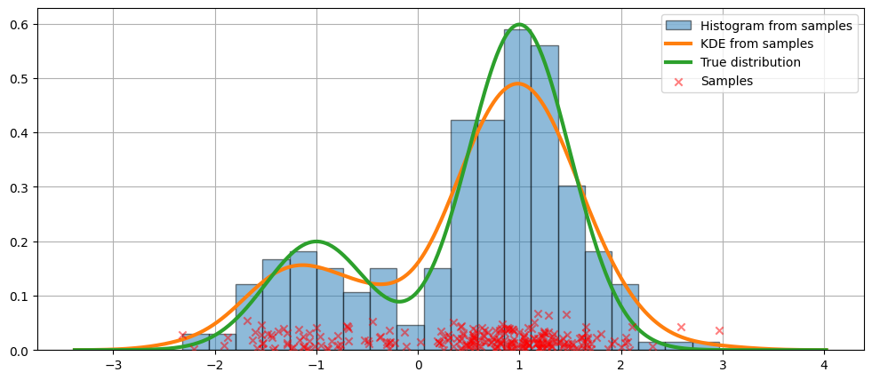
上面的直方圖是不連續的。為了計算連續的機率密度函數,我們可以使用核密度估計。
我們使用 KDEUnivariate 初始化一個單變數核密度估計器。
[5]:
kde = sm.nonparametric.KDEUnivariate(obs_dist)
kde.fit()  # Estimate the densities
[5]:
<statsmodels.nonparametric.kde.KDEUnivariate at 0x7fed558239a0>
我們展示了擬合的圖形,以及真實的分佈。
[6]:
fig = plt.figure(figsize=(12, 5))
ax = fig.add_subplot(111)

# Plot the histogram
ax.hist(
    obs_dist,
    bins=20,
    density=True,
    label="Histogram from samples",
    zorder=5,
    edgecolor="k",
    alpha=0.5,
)

# Plot the KDE as fitted using the default arguments
ax.plot(kde.support, kde.density, lw=3, label="KDE from samples", zorder=10)

# Plot the true distribution
true_values = (
    stats.norm.pdf(loc=dist1_loc, scale=dist1_scale, x=kde.support) * weight1
    + stats.norm.pdf(loc=dist2_loc, scale=dist2_scale, x=kde.support) * weight2
)
ax.plot(kde.support, true_values, lw=3, label="True distribution", zorder=15)

# Plot the samples
ax.scatter(
    obs_dist,
    np.abs(np.random.randn(obs_dist.size)) / 40,
    marker="x",
    color="red",
    zorder=20,
    label="Samples",
    alpha=0.5,
)

ax.legend(loc="best")
ax.grid(True, zorder=-5)
在上面的程式碼中,使用了預設參數。我們也可以改變核的頻寬,我們現在將看到。
使用 bw 參數調整頻寬
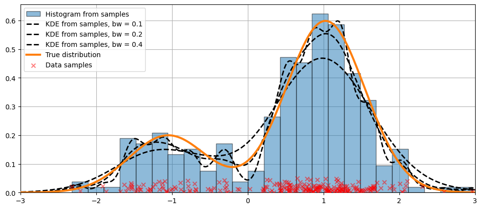
可以使用 bw 參數調整核的頻寬。在以下範例中,bw=0.2 的頻寬似乎可以很好地擬合資料。
[7]:
fig = plt.figure(figsize=(12, 5))
ax = fig.add_subplot(111)

# Plot the histogram
ax.hist(
    obs_dist,
    bins=25,
    label="Histogram from samples",
    zorder=5,
    edgecolor="k",
    density=True,
    alpha=0.5,
)

# Plot the KDE for various bandwidths
for bandwidth in [0.1, 0.2, 0.4]:
    kde.fit(bw=bandwidth)  # Estimate the densities
    ax.plot(
        kde.support,
        kde.density,
        "--",
        lw=2,
        color="k",
        zorder=10,
        label="KDE from samples, bw = {}".format(round(bandwidth, 2)),
    )

# Plot the true distribution
ax.plot(kde.support, true_values, lw=3, label="True distribution", zorder=15)

# Plot the samples
ax.scatter(
    obs_dist,
    np.abs(np.random.randn(obs_dist.size)) / 50,
    marker="x",
    color="red",
    zorder=20,
    label="Data samples",
    alpha=0.5,
)

ax.legend(loc="best")
ax.set_xlim([-3, 3])
ax.grid(True, zorder=-5)
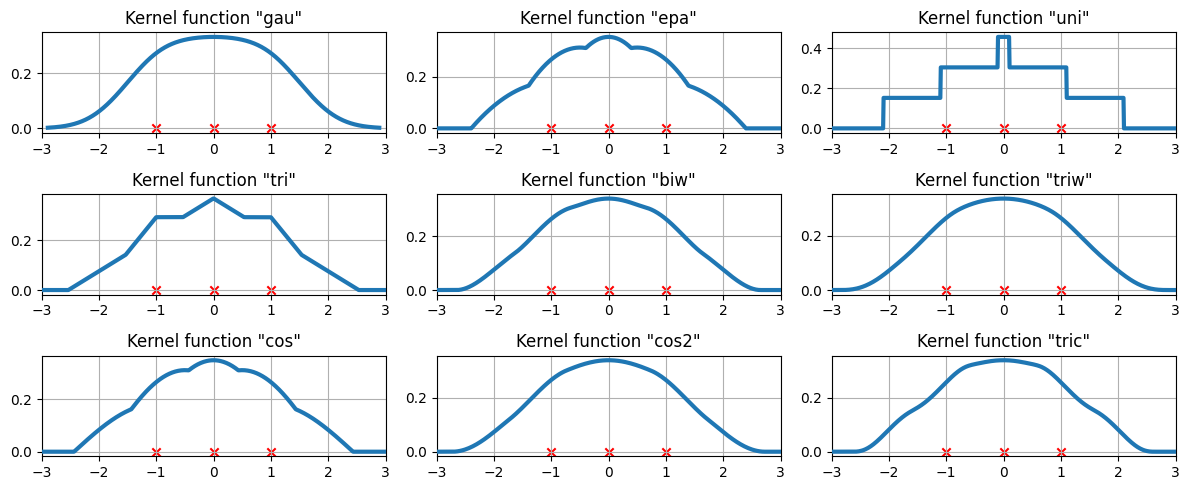
比較核函數
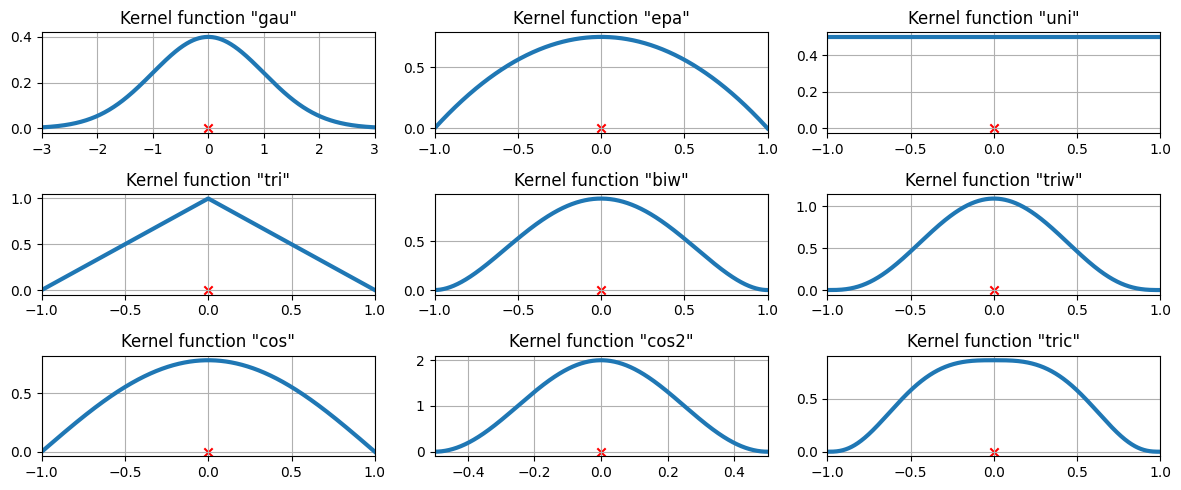
在上面的範例中,使用了高斯核。還有其他幾個核可用。
[8]:
from statsmodels.nonparametric.kde import kernel_switch

list(kernel_switch.keys())
[8]:
['gau', 'epa', 'uni', 'tri', 'biw', 'triw', 'cos', 'cos2', 'tric']
可用的核函數
[9]:
# Create a figure
fig = plt.figure(figsize=(12, 5))

# Enumerate every option for the kernel
for i, (ker_name, ker_class) in enumerate(kernel_switch.items()):

    # Initialize the kernel object
    kernel = ker_class()

    # Sample from the domain
    domain = kernel.domain or [-3, 3]
    x_vals = np.linspace(*domain, num=2 ** 10)
    y_vals = kernel(x_vals)

    # Create a subplot, set the title
    ax = fig.add_subplot(3, 3, i + 1)
    ax.set_title('Kernel function "{}"'.format(ker_name))
    ax.plot(x_vals, y_vals, lw=3, label="{}".format(ker_name))
    ax.scatter([0], [0], marker="x", color="red")
    plt.grid(True, zorder=-5)
    ax.set_xlim(domain)

plt.tight_layout()
三個資料點上可用的核函數
我們現在檢查核密度估計如何擬合到三個等距的資料點。
[10]:
# Create three equidistant points
data = np.linspace(-1, 1, 3)
kde = sm.nonparametric.KDEUnivariate(data)

# Create a figure
fig = plt.figure(figsize=(12, 5))

# Enumerate every option for the kernel
for i, kernel in enumerate(kernel_switch.keys()):

    # Create a subplot, set the title
    ax = fig.add_subplot(3, 3, i + 1)
    ax.set_title('Kernel function "{}"'.format(kernel))

    # Fit the model (estimate densities)
    kde.fit(kernel=kernel, fft=False, gridsize=2 ** 10)

    # Create the plot
    ax.plot(kde.support, kde.density, lw=3, label="KDE from samples", zorder=10)
    ax.scatter(data, np.zeros_like(data), marker="x", color="red")
    plt.grid(True, zorder=-5)
    ax.set_xlim([-3, 3])

plt.tight_layout()
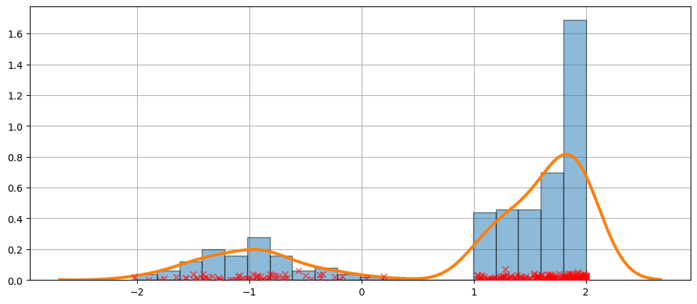
一個更困難的例子
擬合並不總是完美的。請參閱下面的範例,了解更難的情況。
[11]:
obs_dist = mixture_rvs(
    [0.25, 0.75],
    size=250,
    dist=[stats.norm, stats.beta],
    kwargs=(dict(loc=-1, scale=0.5), dict(loc=1, scale=1, args=(1, 0.5))),
)
[12]:
kde = sm.nonparametric.KDEUnivariate(obs_dist)
kde.fit()
[12]:
<statsmodels.nonparametric.kde.KDEUnivariate at 0x7fed52347940>
[13]:
fig = plt.figure(figsize=(12, 5))
ax = fig.add_subplot(111)
ax.hist(obs_dist, bins=20, density=True, edgecolor="k", zorder=4, alpha=0.5)
ax.plot(kde.support, kde.density, lw=3, zorder=7)
# Plot the samples
ax.scatter(
    obs_dist,
    np.abs(np.random.randn(obs_dist.size)) / 50,
    marker="x",
    color="red",
    zorder=20,
    label="Data samples",
    alpha=0.5,
)
ax.grid(True, zorder=-5)
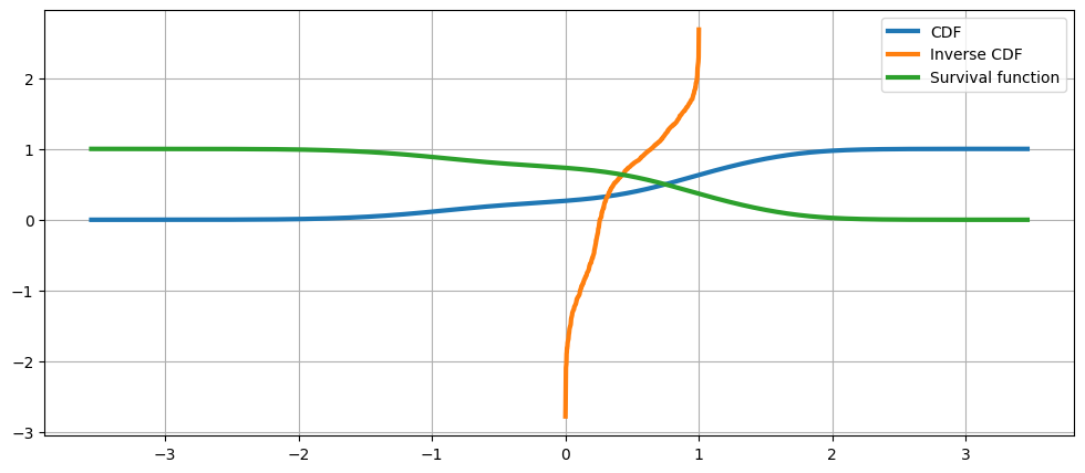
KDE 是一種分佈
由於 KDE 是一種分佈,我們可以存取屬性和方法,例如:
熵評估cdficdfsfcumhazard
[14]:
obs_dist = mixture_rvs(
    [0.25, 0.75],
    size=1000,
    dist=[stats.norm, stats.norm],
    kwargs=(dict(loc=-1, scale=0.5), dict(loc=1, scale=0.5)),
)
kde = sm.nonparametric.KDEUnivariate(obs_dist)
kde.fit(gridsize=2 ** 10)
[14]:
<statsmodels.nonparametric.kde.KDEUnivariate at 0x7fed535c1c00>
[15]:
kde.entropy
[15]:
1.314324140492138
[16]:
kde.evaluate(-1)
[16]:
array([0.18085886])
累積分佈、其反函數和生存函數
[17]:
fig = plt.figure(figsize=(12, 5))
ax = fig.add_subplot(111)

ax.plot(kde.support, kde.cdf, lw=3, label="CDF")
ax.plot(np.linspace(0, 1, num=kde.icdf.size), kde.icdf, lw=3, label="Inverse CDF")
ax.plot(kde.support, kde.sf, lw=3, label="Survival function")
ax.legend(loc="best")
ax.grid(True, zorder=-5)
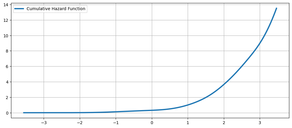
累積風險函數
[18]:
fig = plt.figure(figsize=(12, 5))
ax = fig.add_subplot(111)
ax.plot(kde.support, kde.cumhazard, lw=3, label="Cumulative Hazard Function")
ax.legend(loc="best")
ax.grid(True, zorder=-5)
上次更新:2024 年 10 月 03 日