線性迴歸診斷
在現實生活中,反應變數和目標變數之間的關係很少是線性的。在這裡,我們利用 statsmodels 的輸出,以視覺化方式識別將 線性迴歸 模型擬合到非線性關係時可能出現的問題。主要目標是重現 James 等人在 An Introduction to Statistical Learning (ISLR) 一書的「潛在問題」章節 (第 3.3.3 節) 中討論的可視化。
[1]:
import statsmodels
import statsmodels.formula.api as smf
import pandas as pd
簡單多元線性迴歸
首先,讓我們從 ISLR 書籍的第 2 章加載廣告數據,並將線性模型擬合到它。
[2]:
# Load data
data_url = "https://raw.githubusercontent.com/nguyen-toan/ISLR/07fd968ea484b5f6febc7b392a28eb64329a4945/dataset/Advertising.csv"
df = pd.read_csv(data_url).drop('Unnamed: 0', axis=1)
df.head()
[2]:
| 電視 | 廣播 | 報紙 | 銷售額 | |
|---|---|---|---|---|
| 0 | 230.1 | 37.8 | 69.2 | 22.1 |
| 1 | 44.5 | 39.3 | 45.1 | 10.4 |
| 2 | 17.2 | 45.9 | 69.3 | 9.3 |
| 3 | 151.5 | 41.3 | 58.5 | 18.5 |
| 4 | 180.8 | 10.8 | 58.4 | 12.9 |
[3]:
# Fitting linear model
res = smf.ols(formula= "Sales ~ TV + Radio + Newspaper", data=df).fit()
res.summary()
[3]:
| 依賴變數 | 銷售額 | R 平方 | 0.897 |
|---|---|---|---|
| 模型 | OLS | 調整後 R 平方 | 0.896 |
| 方法 | 最小平方法 | F 統計量 | 570.3 |
| 日期 | 週四,2024 年 10 月 3 日 | 機率 (F 統計量) | 1.58e-96 |
| 時間 | 15:45:11 | 對數概似 | -386.18 |
| 觀測值數量 | 200 | AIC | 780.4 |
| 殘差自由度 | 196 | BIC | 793.6 |
| 模型自由度 | 3 | ||
| 共變異數類型 | 非穩健 |
| 係數 | 標準誤 | t | P>|t| | [0.025 | 0.975] | |
|---|---|---|---|---|---|---|
| 截距 | 2.9389 | 0.312 | 9.422 | 0.000 | 2.324 | 3.554 |
| 電視 | 0.0458 | 0.001 | 32.809 | 0.000 | 0.043 | 0.049 |
| 廣播 | 0.1885 | 0.009 | 21.893 | 0.000 | 0.172 | 0.206 |
| 報紙 | -0.0010 | 0.006 | -0.177 | 0.860 | -0.013 | 0.011 |
| Omnibus | 60.414 | Durbin-Watson | 2.084 |
|---|---|---|---|
| 機率(Omnibus) | 0.000 | Jarque-Bera (JB) | 151.241 |
| 偏度 | -1.327 | 機率(JB) | 1.44e-33 |
| 峰度 | 6.332 | 條件數 | 454. |
註解
[1] 標準誤差假設誤差的共變異數矩陣已正確指定。
診斷圖/表
在下面,我們先呈現一個基本程式碼,稍後我們將使用它來生成以下診斷圖
a. residual
b. qq
c. scale location
d. leverage
和一個表格
a. vif
[4]:
# base code
import numpy as np
import seaborn as sns
from statsmodels.tools.tools import maybe_unwrap_results
from statsmodels.graphics.gofplots import ProbPlot
from statsmodels.stats.outliers_influence import variance_inflation_factor
import matplotlib.pyplot as plt
from typing import Type

style_talk = 'seaborn-talk'    #refer to plt.style.available

class LinearRegDiagnostic():
    """
    Diagnostic plots to identify potential problems in a linear regression fit.
    Mainly,
        a. non-linearity of data
        b. Correlation of error terms
        c. non-constant variance
        d. outliers
        e. high-leverage points
        f. collinearity

    Authors:
        Prajwal Kafle (p33ajkafle@gmail.com, where 3 = r)
        Does not come with any sort of warranty.
        Please test the code one your end before using.

        Matt Spinelli (m3spinelli@gmail.com, where 3 = r)
        (1) Fixed incorrect annotation of the top most extreme residuals in
            the Residuals vs Fitted and, especially, the Normal Q-Q plots.
        (2) Changed Residuals vs Leverage plot to match closer the y-axis
            range shown in the equivalent plot in the R package ggfortify.
        (3) Added horizontal line at y=0 in Residuals vs Leverage plot to
            match the plots in R package ggfortify and base R.
        (4) Added option for placing a vertical guideline on the Residuals
            vs Leverage plot using the rule of thumb of h = 2p/n to denote
            high leverage (high_leverage_threshold=True).
        (5) Added two more ways to compute the Cook's Distance (D) threshold:
            * 'baseR': D > 1 and D > 0.5 (default)
            * 'convention': D > 4/n
            * 'dof': D > 4 / (n - k - 1)
        (6) Fixed class name to conform to Pascal casing convention
        (7) Fixed Residuals vs Leverage legend to work with loc='best'
    """

    def __init__(self,
                 results: Type[statsmodels.regression.linear_model.RegressionResultsWrapper]) -> None:
        """
        For a linear regression model, generates following diagnostic plots:

        a. residual
        b. qq
        c. scale location and
        d. leverage

        and a table

        e. vif

        Args:
            results (Type[statsmodels.regression.linear_model.RegressionResultsWrapper]):
                must be instance of statsmodels.regression.linear_model object

        Raises:
            TypeError: if instance does not belong to above object

        Example:
        >>> import numpy as np
        >>> import pandas as pd
        >>> import statsmodels.formula.api as smf
        >>> x = np.linspace(-np.pi, np.pi, 100)
        >>> y = 3*x + 8 + np.random.normal(0,1, 100)
        >>> df = pd.DataFrame({'x':x, 'y':y})
        >>> res = smf.ols(formula= "y ~ x", data=df).fit()
        >>> cls = Linear_Reg_Diagnostic(res)
        >>> cls(plot_context="seaborn-v0_8-paper")

        In case you do not need all plots you can also independently make an individual plot/table
        in following ways

        >>> cls = Linear_Reg_Diagnostic(res)
        >>> cls.residual_plot()
        >>> cls.qq_plot()
        >>> cls.scale_location_plot()
        >>> cls.leverage_plot()
        >>> cls.vif_table()
        """

        if isinstance(results, statsmodels.regression.linear_model.RegressionResultsWrapper) is False:
            raise TypeError("result must be instance of statsmodels.regression.linear_model.RegressionResultsWrapper object")

        self.results = maybe_unwrap_results(results)

        self.y_true = self.results.model.endog
        self.y_predict = self.results.fittedvalues
        self.xvar = self.results.model.exog
        self.xvar_names = self.results.model.exog_names

        self.residual = np.array(self.results.resid)
        influence = self.results.get_influence()
        self.residual_norm = influence.resid_studentized_internal
        self.leverage = influence.hat_matrix_diag
        self.cooks_distance = influence.cooks_distance[0]
        self.nparams = len(self.results.params)
        self.nresids = len(self.residual_norm)

    def __call__(self, plot_context='seaborn-v0_8-paper', **kwargs):
        # print(plt.style.available)
        with plt.style.context(plot_context):
            fig, ax = plt.subplots(nrows=2, ncols=2, figsize=(10,10))
            self.residual_plot(ax=ax[0,0])
            self.qq_plot(ax=ax[0,1])
            self.scale_location_plot(ax=ax[1,0])
            self.leverage_plot(
                ax=ax[1,1],
                high_leverage_threshold = kwargs.get('high_leverage_threshold'),
                cooks_threshold = kwargs.get('cooks_threshold'))
            plt.show()

        return self.vif_table(), fig, ax,

    def residual_plot(self, ax=None):
        """
        Residual vs Fitted Plot

        Graphical tool to identify non-linearity.
        (Roughly) Horizontal red line is an indicator that the residual has a linear pattern
        """
        if ax is None:
            fig, ax = plt.subplots()

        sns.residplot(
            x=self.y_predict,
            y=self.residual,
            lowess=True,
            scatter_kws={'alpha': 0.5},
            line_kws={'color': 'red', 'lw': 1, 'alpha': 0.8},
            ax=ax)

        # annotations
        residual_abs = np.abs(self.residual)
        abs_resid = np.flip(np.argsort(residual_abs), 0)
        abs_resid_top_3 = abs_resid[:3]
        for i in abs_resid_top_3:
            ax.annotate(
                i,
                xy=(self.y_predict[i], self.residual[i]),
                color='C3')

        ax.set_title('Residuals vs Fitted', fontweight="bold")
        ax.set_xlabel('Fitted values')
        ax.set_ylabel('Residuals')
        return ax

    def qq_plot(self, ax=None):
        """
        Standarized Residual vs Theoretical Quantile plot

        Used to visually check if residuals are normally distributed.
        Points spread along the diagonal line will suggest so.
        """
        if ax is None:
            fig, ax = plt.subplots()

        QQ = ProbPlot(self.residual_norm)
        fig = QQ.qqplot(line='45', alpha=0.5, lw=1, ax=ax)

        # annotations
        abs_norm_resid = np.flip(np.argsort(np.abs(self.residual_norm)), 0)
        abs_norm_resid_top_3 = abs_norm_resid[:3]
        for i, x, y in self.__qq_top_resid(QQ.theoretical_quantiles, abs_norm_resid_top_3):
            ax.annotate(
                i,
                xy=(x, y),
                ha='right',
                color='C3')

        ax.set_title('Normal Q-Q', fontweight="bold")
        ax.set_xlabel('Theoretical Quantiles')
        ax.set_ylabel('Standardized Residuals')
        return ax

    def scale_location_plot(self, ax=None):
        """
        Sqrt(Standarized Residual) vs Fitted values plot

        Used to check homoscedasticity of the residuals.
        Horizontal line will suggest so.
        """
        if ax is None:
            fig, ax = plt.subplots()

        residual_norm_abs_sqrt = np.sqrt(np.abs(self.residual_norm))

        ax.scatter(self.y_predict, residual_norm_abs_sqrt, alpha=0.5);
        sns.regplot(
            x=self.y_predict,
            y=residual_norm_abs_sqrt,
            scatter=False, ci=False,
            lowess=True,
            line_kws={'color': 'red', 'lw': 1, 'alpha': 0.8},
            ax=ax)

        # annotations
        abs_sq_norm_resid = np.flip(np.argsort(residual_norm_abs_sqrt), 0)
        abs_sq_norm_resid_top_3 = abs_sq_norm_resid[:3]
        for i in abs_sq_norm_resid_top_3:
            ax.annotate(
                i,
                xy=(self.y_predict[i], residual_norm_abs_sqrt[i]),
                color='C3')

        ax.set_title('Scale-Location', fontweight="bold")
        ax.set_xlabel('Fitted values')
        ax.set_ylabel(r'$\sqrt{|\mathrm{Standardized\ Residuals}|}$');
        return ax

    def leverage_plot(self, ax=None, high_leverage_threshold=False, cooks_threshold='baseR'):
        """
        Residual vs Leverage plot

        Points falling outside Cook's distance curves are considered observation that can sway the fit
        aka are influential.
        Good to have none outside the curves.
        """
        if ax is None:
            fig, ax = plt.subplots()

        ax.scatter(
            self.leverage,
            self.residual_norm,
            alpha=0.5);

        sns.regplot(
            x=self.leverage,
            y=self.residual_norm,
            scatter=False,
            ci=False,
            lowess=True,
            line_kws={'color': 'red', 'lw': 1, 'alpha': 0.8},
            ax=ax)

        # annotations
        leverage_top_3 = np.flip(np.argsort(self.cooks_distance), 0)[:3]
        for i in leverage_top_3:
            ax.annotate(
                i,
                xy=(self.leverage[i], self.residual_norm[i]),
                color = 'C3')

        factors = []
        if cooks_threshold == 'baseR' or cooks_threshold is None:
            factors = [1, 0.5]
        elif cooks_threshold == 'convention':
            factors = [4/self.nresids]
        elif cooks_threshold == 'dof':
            factors = [4/ (self.nresids - self.nparams)]
        else:
            raise ValueError("threshold_method must be one of the following: 'convention', 'dof', or 'baseR' (default)")
        for i, factor in enumerate(factors):
            label = "Cook's distance" if i == 0 else None
            xtemp, ytemp = self.__cooks_dist_line(factor)
            ax.plot(xtemp, ytemp, label=label, lw=1.25, ls='--', color='red')
            ax.plot(xtemp, np.negative(ytemp), lw=1.25, ls='--', color='red')

        if high_leverage_threshold:
            high_leverage = 2 * self.nparams / self.nresids
            if max(self.leverage) > high_leverage:
                ax.axvline(high_leverage, label='High leverage', ls='-.', color='purple', lw=1)

        ax.axhline(0, ls='dotted', color='black', lw=1.25)
        ax.set_xlim(0, max(self.leverage)+0.01)
        ax.set_ylim(min(self.residual_norm)-0.1, max(self.residual_norm)+0.1)
        ax.set_title('Residuals vs Leverage', fontweight="bold")
        ax.set_xlabel('Leverage')
        ax.set_ylabel('Standardized Residuals')
        plt.legend(loc='best')
        return ax

    def vif_table(self):
        """
        VIF table

        VIF, the variance inflation factor, is a measure of multicollinearity.
        VIF > 5 for a variable indicates that it is highly collinear with the
        other input variables.
        """
        vif_df = pd.DataFrame()
        vif_df["Features"] = self.xvar_names
        vif_df["VIF Factor"] = [variance_inflation_factor(self.xvar, i) for i in range(self.xvar.shape[1])]

        return (vif_df
                .sort_values("VIF Factor")
                .round(2))


    def __cooks_dist_line(self, factor):
        """
        Helper function for plotting Cook's distance curves
        """
        p = self.nparams
        formula = lambda x: np.sqrt((factor * p * (1 - x)) / x)
        x = np.linspace(0.001, max(self.leverage), 50)
        y = formula(x)
        return x, y


    def __qq_top_resid(self, quantiles, top_residual_indices):
        """
        Helper generator function yielding the index and coordinates
        """
        offset = 0
        quant_index = 0
        previous_is_negative = None
        for resid_index in top_residual_indices:
            y = self.residual_norm[resid_index]
            is_negative = y < 0
            if previous_is_negative == None or previous_is_negative == is_negative:
                offset += 1
            else:
                quant_index -= offset
            x = quantiles[quant_index] if is_negative else np.flip(quantiles, 0)[quant_index]
            quant_index += 1
            previous_is_negative = is_negative
            yield resid_index, x, y
使用
* fitted model on the Advertising data above and
* the base code provided
現在我們逐一生成診斷圖。
[5]:
cls = LinearRegDiagnostic(res)
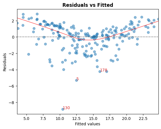
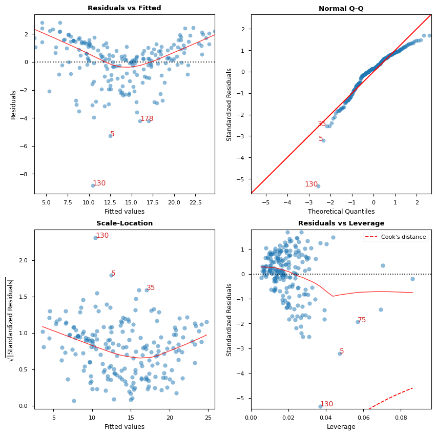
A. 殘差 vs 擬合值
用於識別非線性的圖形工具。
在圖表中,紅色 (大致) 水平線表示殘差具有線性模式。
[6]:
cls.residual_plot();
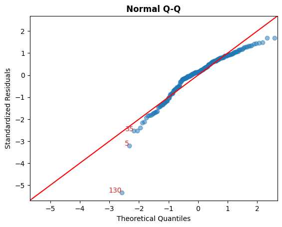
B. 標準化殘差 vs 理論分位數
此圖用於視覺檢查殘差是否呈常態分佈。
沿著對角線散佈的點表示如此。
[7]:
cls.qq_plot();
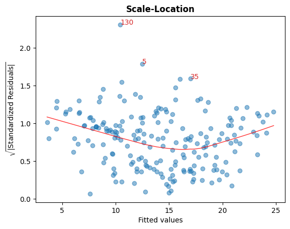
C. Sqrt(標準化殘差) vs 擬合值
此圖用於檢查殘差的同質變異性。
圖中接近水平的紅線表示如此。
[8]:
cls.scale_location_plot();
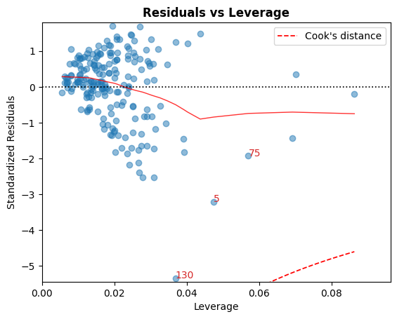
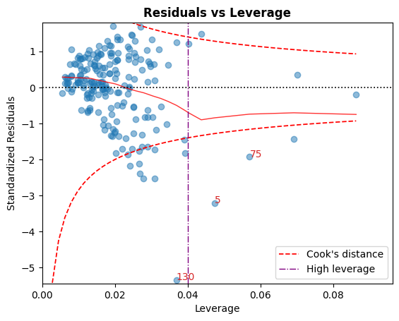
D. 殘差 vs 槓桿
落在庫克距離曲線之外的點被認為是可以影響擬合的觀測值,也就是具有影響力的觀測值。
最好沒有點落在這些曲線之外。
[9]:
cls.leverage_plot();
庫克距離曲線可以使用其他經驗法則來繪製
經驗法則 |
閾值 |
|---|---|
|
\[D_i > 1 \mid D_i > 0.5\]
|
|
\[D_i > { 4 \over n}\]
|
|
\[D_i > {4 \over n - k - 1}\]
|
也可以使用慣例顯示高槓桿準則:\(h_{ii} > {2p \over n}\)。
[10]:
cls.leverage_plot(high_leverage_threshold=True, cooks_threshold='dof');
E. VIF
變異數膨脹因子 (VIF) 是多重共線性的度量。
VIF > 5 表示該變數與其他輸入變數高度共線性。
[11]:
cls.vif_table()
[11]:
| 特徵 | VIF 因子 | |
|---|---|---|
| 1 | 電視 | 1.00 |
| 2 | 廣播 | 1.14 |
| 3 | 報紙 | 1.15 |
| 0 | 截距 | 6.85 |
[12]:
# Alternatively, all diagnostics can be generated in one go as follows.
# Fig and ax can be used to modify axes or plot properties after the fact.
cls = LinearRegDiagnostic(res)
vif, fig, ax = cls()
print(vif)

#fig.savefig('../../docs/source/_static/images/linear_regression_diagnostics_plots.png')
    Features  VIF Factor
1         TV        1.00
2      Radio        1.14
3  Newspaper        1.15
0  Intercept        6.85
有關上述圖表的解釋和注意事項的詳細討論,請參閱 ISLR 書籍。
上次更新:2024 年 10 月 3 日