分位數迴歸
此範例頁面展示如何使用 statsmodels 的 QuantReg 類別,以複製發表於以下文獻的部分分析:
Koenker, Roger and Kevin F. Hallock. “Quantile Regression”. Journal of Economic Perspectives, Volume 15, Number 4, Fall 2001, Pages 143–156
我們有興趣了解 1857 年比利時工人階級家庭樣本中,收入與食物支出的關係(恩格爾數據)。
設定
首先,我們需要載入一些模組並擷取數據。方便的是,恩格爾數據集已隨 statsmodels 一起提供。
[1]:
%matplotlib inline
[2]:
import numpy as np
import pandas as pd
import statsmodels.api as sm
import statsmodels.formula.api as smf
import matplotlib.pyplot as plt

data = sm.datasets.engel.load_pandas().data
data.head()
[2]:
| income | foodexp | |
|---|---|---|
| 0 | 420.157651 | 255.839425 |
| 1 | 541.411707 | 310.958667 |
| 2 | 901.157457 | 485.680014 |
| 3 | 639.080229 | 402.997356 |
| 4 | 750.875606 | 495.560775 |
最小絕對偏差
LAD 模型是分位數迴歸的一種特殊情況,其中 q=0.5
[3]:
mod = smf.quantreg("foodexp ~ income", data)
res = mod.fit(q=0.5)
print(res.summary())
                         QuantReg Regression Results
==============================================================================
Dep. Variable:                foodexp   Pseudo R-squared:               0.6206
Model:                       QuantReg   Bandwidth:                       64.51
Method:                 Least Squares   Sparsity:                        209.3
Date:                Thu, 03 Oct 2024   No. Observations:                  235
Time:                        15:46:19   Df Residuals:                      233
                                        Df Model:                            1
==============================================================================
                 coef    std err          t      P>|t|      [0.025      0.975]
------------------------------------------------------------------------------
Intercept     81.4823     14.634      5.568      0.000      52.649     110.315
income         0.5602      0.013     42.516      0.000       0.534       0.586
==============================================================================

The condition number is large, 2.38e+03. This might indicate that there are
strong multicollinearity or other numerical problems.
視覺化結果
我們針對介於 .05 和 .95 之間的許多分位數估計分位數迴歸模型,並將每個模型的最適合線與普通最小平方法結果進行比較。
準備繪圖數據
為方便起見,我們將分位數迴歸結果放入 Pandas DataFrame 中,並將 OLS 結果放入字典中。
[4]:
quantiles = np.arange(0.05, 0.96, 0.1)


def fit_model(q):
    res = mod.fit(q=q)
    return [q, res.params["Intercept"], res.params["income"]] + res.conf_int().loc[
        "income"
    ].tolist()


models = [fit_model(x) for x in quantiles]
models = pd.DataFrame(models, columns=["q", "a", "b", "lb", "ub"])

ols = smf.ols("foodexp ~ income", data).fit()
ols_ci = ols.conf_int().loc["income"].tolist()
ols = dict(
    a=ols.params["Intercept"], b=ols.params["income"], lb=ols_ci[0], ub=ols_ci[1]
)

print(models)
print(ols)
      q           a         b        lb        ub
0  0.05  124.880096  0.343361  0.268632  0.418090
1  0.15  111.693660  0.423708  0.382780  0.464636
2  0.25   95.483539  0.474103  0.439900  0.508306
3  0.35  105.841294  0.488901  0.457759  0.520043
4  0.45   81.083647  0.552428  0.525021  0.579835
5  0.55   89.661370  0.565601  0.540955  0.590247
6  0.65   74.033434  0.604576  0.582169  0.626982
7  0.75   62.396584  0.644014  0.622411  0.665617
8  0.85   52.272216  0.677603  0.657383  0.697823
9  0.95   64.103964  0.709069  0.687831  0.730306
{'a': np.float64(147.47538852370573), 'b': np.float64(0.48517842367692354), 'lb': 0.4568738130184233, 'ub': 0.5134830343354237}
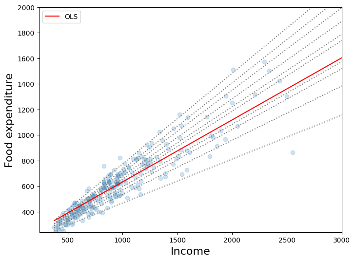
第一張圖
此圖比較了 10 個分位數迴歸模型的最適合線與最小平方法擬合線。正如 Koenker 和 Hallock (2001) 指出的,我們看到:
食物支出隨著收入增加而增加
食物支出的離散程度隨著收入增加而增加
最小平方法估計對低收入觀察值的擬合效果相當差(即 OLS 線穿過大多數低收入家庭上方)
[5]:
x = np.arange(data.income.min(), data.income.max(), 50)
get_y = lambda a, b: a + b * x

fig, ax = plt.subplots(figsize=(8, 6))

for i in range(models.shape[0]):
    y = get_y(models.a[i], models.b[i])
    ax.plot(x, y, linestyle="dotted", color="grey")

y = get_y(ols["a"], ols["b"])

ax.plot(x, y, color="red", label="OLS")
ax.scatter(data.income, data.foodexp, alpha=0.2)
ax.set_xlim((240, 3000))
ax.set_ylim((240, 2000))
legend = ax.legend()
ax.set_xlabel("Income", fontsize=16)
ax.set_ylabel("Food expenditure", fontsize=16)
[5]:
Text(0, 0.5, 'Food expenditure')
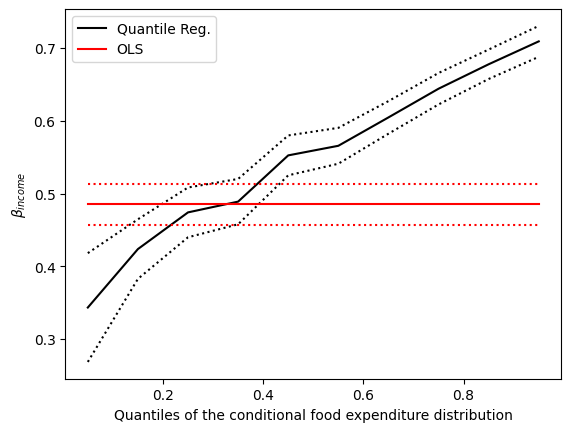
第二張圖
黑色虛線構成 10 個分位數迴歸估計值(黑色實線)周圍的 95% 逐點信賴區間。紅色線代表 OLS 迴歸結果及其 95% 信賴區間。
在大多數情況下,分位數迴歸點估計值位於 OLS 信賴區間之外,這表明收入對食物支出的影響可能在整個分佈中不恆定。
[6]:
n = models.shape[0]
p1 = plt.plot(models.q, models.b, color="black", label="Quantile Reg.")
p2 = plt.plot(models.q, models.ub, linestyle="dotted", color="black")
p3 = plt.plot(models.q, models.lb, linestyle="dotted", color="black")
p4 = plt.plot(models.q, [ols["b"]] * n, color="red", label="OLS")
p5 = plt.plot(models.q, [ols["lb"]] * n, linestyle="dotted", color="red")
p6 = plt.plot(models.q, [ols["ub"]] * n, linestyle="dotted", color="red")
plt.ylabel(r"$\beta_{income}$")
plt.xlabel("Quantiles of the conditional food expenditure distribution")
plt.legend()
plt.show()
上次更新:2024 年 10 月 03 日