指數平滑法
讓我們考慮 Hyndman 和 Athanasopoulos [1] 所著關於指數平滑法的傑出論文的第 7 章。我們將逐步完成本章中的所有範例。
[1] Hyndman, Rob J., 和 George Athanasopoulos. Forecasting: principles and practice. OTexts, 2014.
載入數據
首先,我們載入一些數據。為了方便起見,我們已將 R 數據包含在筆記本中。
[1]:
import os
import numpy as np
import pandas as pd
import matplotlib.pyplot as plt
from statsmodels.tsa.api import ExponentialSmoothing, SimpleExpSmoothing, Holt

%matplotlib inline

data = [
    446.6565,
    454.4733,
    455.663,
    423.6322,
    456.2713,
    440.5881,
    425.3325,
    485.1494,
    506.0482,
    526.792,
    514.2689,
    494.211,
]
index = pd.date_range(start="1996", end="2008", freq="Y")
oildata = pd.Series(data, index)

data = [
    17.5534,
    21.86,
    23.8866,
    26.9293,
    26.8885,
    28.8314,
    30.0751,
    30.9535,
    30.1857,
    31.5797,
    32.5776,
    33.4774,
    39.0216,
    41.3864,
    41.5966,
]
index = pd.date_range(start="1990", end="2005", freq="Y")
air = pd.Series(data, index)

data = [
    263.9177,
    268.3072,
    260.6626,
    266.6394,
    277.5158,
    283.834,
    290.309,
    292.4742,
    300.8307,
    309.2867,
    318.3311,
    329.3724,
    338.884,
    339.2441,
    328.6006,
    314.2554,
    314.4597,
    321.4138,
    329.7893,
    346.3852,
    352.2979,
    348.3705,
    417.5629,
    417.1236,
    417.7495,
    412.2339,
    411.9468,
    394.6971,
    401.4993,
    408.2705,
    414.2428,
]
index = pd.date_range(start="1970", end="2001", freq="Y")
livestock2 = pd.Series(data, index)

data = [407.9979, 403.4608, 413.8249, 428.105, 445.3387, 452.9942, 455.7402]
index = pd.date_range(start="2001", end="2008", freq="Y")
livestock3 = pd.Series(data, index)

data = [
    41.7275,
    24.0418,
    32.3281,
    37.3287,
    46.2132,
    29.3463,
    36.4829,
    42.9777,
    48.9015,
    31.1802,
    37.7179,
    40.4202,
    51.2069,
    31.8872,
    40.9783,
    43.7725,
    55.5586,
    33.8509,
    42.0764,
    45.6423,
    59.7668,
    35.1919,
    44.3197,
    47.9137,
]
index = pd.date_range(start="2005", end="2010-Q4", freq="QS-OCT")
aust = pd.Series(data, index)
/tmp/ipykernel_3946/536270367.py:23: FutureWarning: 'Y' is deprecated and will be removed in a future version, please use 'YE' instead.
  index = pd.date_range(start="1996", end="2008", freq="Y")
/tmp/ipykernel_3946/536270367.py:43: FutureWarning: 'Y' is deprecated and will be removed in a future version, please use 'YE' instead.
  index = pd.date_range(start="1990", end="2005", freq="Y")
/tmp/ipykernel_3946/536270367.py:79: FutureWarning: 'Y' is deprecated and will be removed in a future version, please use 'YE' instead.
  index = pd.date_range(start="1970", end="2001", freq="Y")
/tmp/ipykernel_3946/536270367.py:83: FutureWarning: 'Y' is deprecated and will be removed in a future version, please use 'YE' instead.
  index = pd.date_range(start="2001", end="2008", freq="Y")
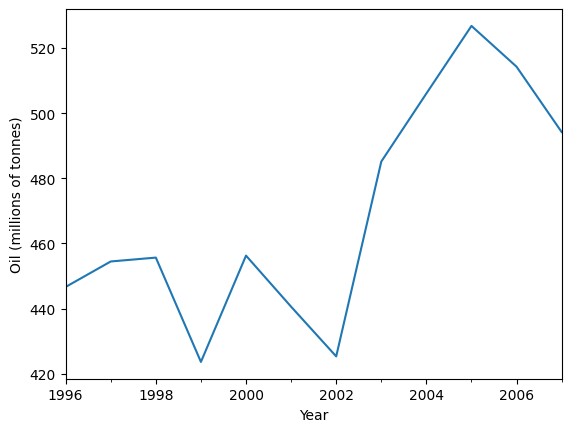
簡單指數平滑法
讓我們使用簡單指數平滑法來預測以下石油數據。
[2]:
ax = oildata.plot()
ax.set_xlabel("Year")
ax.set_ylabel("Oil (millions of tonnes)")
print("Figure 7.1: Oil production in Saudi Arabia from 1996 to 2007.")
Figure 7.1: Oil production in Saudi Arabia from 1996 to 2007.
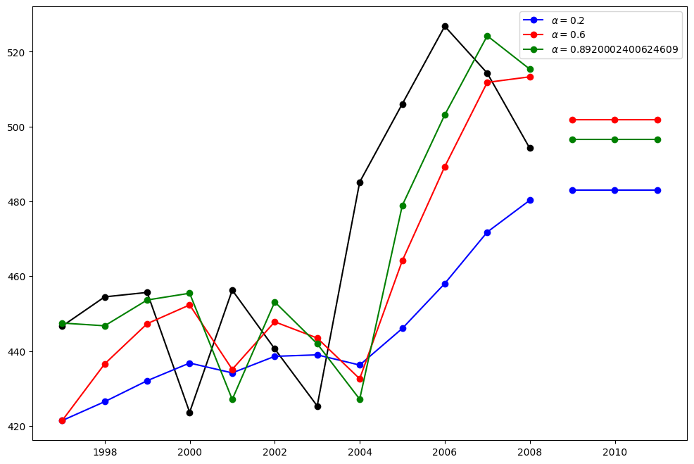
在這裡,我們執行三種簡單指數平滑法的變體:1. 在 fit1 中,我們不使用自動最佳化,而是選擇明確地為模型提供 \(\alpha=0.2\) 參數。2. 在 fit2 中,如上所述,我們選擇 \(\alpha=0.6\)。3. 在 fit3 中,我們允許 statsmodels 自動找到最佳化的 \(\alpha\) 值。這是建議的方法。
[3]:
fit1 = SimpleExpSmoothing(oildata, initialization_method="heuristic").fit(
    smoothing_level=0.2, optimized=False
)
fcast1 = fit1.forecast(3).rename(r"$\alpha=0.2$")
fit2 = SimpleExpSmoothing(oildata, initialization_method="heuristic").fit(
    smoothing_level=0.6, optimized=False
)
fcast2 = fit2.forecast(3).rename(r"$\alpha=0.6$")
fit3 = SimpleExpSmoothing(oildata, initialization_method="estimated").fit()
fcast3 = fit3.forecast(3).rename(r"$\alpha=%s$" % fit3.model.params["smoothing_level"])

plt.figure(figsize=(12, 8))
plt.plot(oildata, marker="o", color="black")
plt.plot(fit1.fittedvalues, marker="o", color="blue")
(line1,) = plt.plot(fcast1, marker="o", color="blue")
plt.plot(fit2.fittedvalues, marker="o", color="red")
(line2,) = plt.plot(fcast2, marker="o", color="red")
plt.plot(fit3.fittedvalues, marker="o", color="green")
(line3,) = plt.plot(fcast3, marker="o", color="green")
plt.legend([line1, line2, line3], [fcast1.name, fcast2.name, fcast3.name])
[3]:
<matplotlib.legend.Legend at 0x7f4b3edd1930>
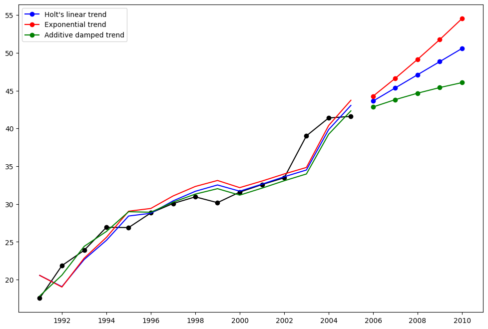
霍爾特方法
讓我們看看另一個範例。這次我們使用空氣污染數據和霍爾特方法。我們將再次擬合三個範例。1. 在 fit1 中,我們再次選擇不使用最佳化器,並為 \(\alpha=0.8\) 和 \(\beta=0.2\) 提供明確的值。2. 在 fit2 中,我們與 fit1 中執行相同的操作,但選擇使用指數模型而不是霍爾特的加性模型。3. 在 fit3 中,我們使用了霍爾特加性模型的阻尼版本,但允許阻尼參數 \(\phi\) 在固定 \(\alpha=0.8\) 和 \(\beta=0.2\) 的值時進行最佳化。
[4]:
fit1 = Holt(air, initialization_method="estimated").fit(
    smoothing_level=0.8, smoothing_trend=0.2, optimized=False
)
fcast1 = fit1.forecast(5).rename("Holt's linear trend")
fit2 = Holt(air, exponential=True, initialization_method="estimated").fit(
    smoothing_level=0.8, smoothing_trend=0.2, optimized=False
)
fcast2 = fit2.forecast(5).rename("Exponential trend")
fit3 = Holt(air, damped_trend=True, initialization_method="estimated").fit(
    smoothing_level=0.8, smoothing_trend=0.2
)
fcast3 = fit3.forecast(5).rename("Additive damped trend")

plt.figure(figsize=(12, 8))
plt.plot(air, marker="o", color="black")
plt.plot(fit1.fittedvalues, color="blue")
(line1,) = plt.plot(fcast1, marker="o", color="blue")
plt.plot(fit2.fittedvalues, color="red")
(line2,) = plt.plot(fcast2, marker="o", color="red")
plt.plot(fit3.fittedvalues, color="green")
(line3,) = plt.plot(fcast3, marker="o", color="green")
plt.legend([line1, line2, line3], [fcast1.name, fcast2.name, fcast3.name])
[4]:
<matplotlib.legend.Legend at 0x7f4b3c76be20>
季節性調整數據
讓我們看看一些季節性調整的牲畜數據。我們擬合五個霍爾特模型。當我們使用指數與加性以及阻尼與非阻尼時,下表允許我們比較結果。
注意:fit4 不允許通過提供 \(\phi=0.98\) 的固定值來最佳化參數 \(\phi\)。
[5]:
fit1 = SimpleExpSmoothing(livestock2, initialization_method="estimated").fit()
fit2 = Holt(livestock2, initialization_method="estimated").fit()
fit3 = Holt(livestock2, exponential=True, initialization_method="estimated").fit()
fit4 = Holt(livestock2, damped_trend=True, initialization_method="estimated").fit(
    damping_trend=0.98
)
fit5 = Holt(
    livestock2, exponential=True, damped_trend=True, initialization_method="estimated"
).fit()
params = [
    "smoothing_level",
    "smoothing_trend",
    "damping_trend",
    "initial_level",
    "initial_trend",
]
results = pd.DataFrame(
    index=[r"$\alpha$", r"$\beta$", r"$\phi$", r"$l_0$", "$b_0$", "SSE"],
    columns=["SES", "Holt's", "Exponential", "Additive", "Multiplicative"],
)
results["SES"] = [fit1.params[p] for p in params] + [fit1.sse]
results["Holt's"] = [fit2.params[p] for p in params] + [fit2.sse]
results["Exponential"] = [fit3.params[p] for p in params] + [fit3.sse]
results["Additive"] = [fit4.params[p] for p in params] + [fit4.sse]
results["Multiplicative"] = [fit5.params[p] for p in params] + [fit5.sse]
results
[5]:
| SES | 霍爾特 | 指數 | 加性 | 乘法 | |
|---|---|---|---|---|---|
| $\alpha$ | 1.000000 | 0.974338 | 0.977642 | 0.978843 | 0.974912 |
| $\beta$ | NaN | 0.000000 | 0.000000 | 0.000008 | 0.000000 |
| $\phi$ | NaN | NaN | NaN | 0.980000 | 0.981646 |
| $l_0$ | 263.917703 | 258.882683 | 260.335599 | 257.357716 | 258.951817 |
| $b_0$ | NaN | 5.010856 | 1.013780 | 6.645297 | 1.038144 |
| SSE | 6761.350235 | 6004.138207 | 6104.194782 | 6036.597169 | 6081.995045 |
季節性調整數據圖
以下圖允許我們評估上表中擬合的層級和斜率/趨勢分量。
[6]:
for fit in [fit2, fit4]:
    pd.DataFrame(np.c_[fit.level, fit.trend]).rename(
        columns={0: "level", 1: "slope"}
    ).plot(subplots=True)
plt.show()
print(
    "Figure 7.4: Level and slope components for Holt’s linear trend method and the additive damped trend method."
)
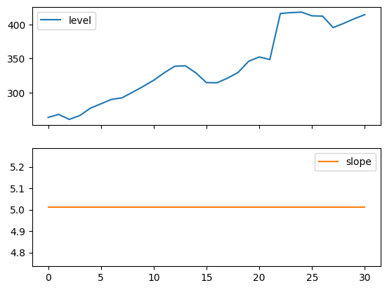
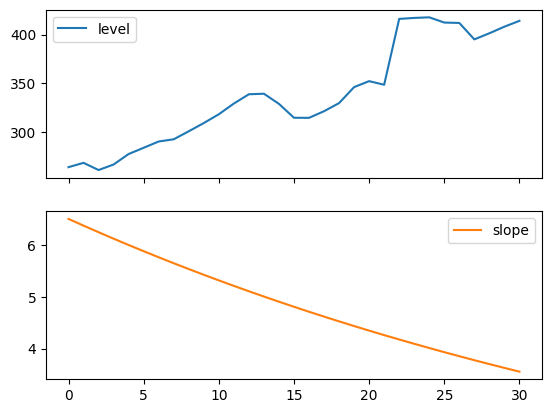
Figure 7.4: Level and slope components for Holt’s linear trend method and the additive damped trend method.
比較
在這裡,我們繪製一個比較簡單指數平滑法和霍爾特方法在各種加性、指數和阻尼組合下的比較圖。所有模型的參數都將由 statsmodels 進行最佳化。
[7]:
fit1 = SimpleExpSmoothing(livestock2, initialization_method="estimated").fit()
fcast1 = fit1.forecast(9).rename("SES")
fit2 = Holt(livestock2, initialization_method="estimated").fit()
fcast2 = fit2.forecast(9).rename("Holt's")
fit3 = Holt(livestock2, exponential=True, initialization_method="estimated").fit()
fcast3 = fit3.forecast(9).rename("Exponential")
fit4 = Holt(livestock2, damped_trend=True, initialization_method="estimated").fit(
    damping_trend=0.98
)
fcast4 = fit4.forecast(9).rename("Additive Damped")
fit5 = Holt(
    livestock2, exponential=True, damped_trend=True, initialization_method="estimated"
).fit()
fcast5 = fit5.forecast(9).rename("Multiplicative Damped")

ax = livestock2.plot(color="black", marker="o", figsize=(12, 8))
livestock3.plot(ax=ax, color="black", marker="o", legend=False)
fcast1.plot(ax=ax, color="red", legend=True)
fcast2.plot(ax=ax, color="green", legend=True)
fcast3.plot(ax=ax, color="blue", legend=True)
fcast4.plot(ax=ax, color="cyan", legend=True)
fcast5.plot(ax=ax, color="magenta", legend=True)
ax.set_ylabel("Livestock, sheep in Asia (millions)")
plt.show()
print(
    "Figure 7.5: Forecasting livestock, sheep in Asia: comparing forecasting performance of non-seasonal methods."
)
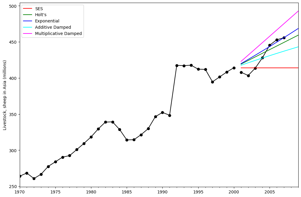
Figure 7.5: Forecasting livestock, sheep in Asia: comparing forecasting performance of non-seasonal methods.
霍爾特-溫特季節性模型
最後,我們能夠執行完整的霍爾特-溫特季節性指數平滑法,包括趨勢分量和季節性分量。statsmodels 允許所有組合,包括以下範例中所示的組合:1. fit1 加性趨勢、週期為 season_length=4 的加性季節性,以及 Box-Cox 轉換的使用。2. fit2 加性趨勢、週期為 season_length=4 的乘法季節性,以及 Box-Cox 轉換的使用。3. fit3 加性阻尼趨勢、週期為 season_length=4 的加性季節性,以及 Box-Cox 轉換的使用。4. fit4 加性阻尼趨勢、週期為 season_length=4 的乘法季節性,以及 Box-Cox 轉換的使用。
該圖顯示了 fit1 和 fit2 的結果和預測。該表允許我們比較結果和參數化。
[8]:
fit1 = ExponentialSmoothing(
    aust,
    seasonal_periods=4,
    trend="add",
    seasonal="add",
    use_boxcox=True,
    initialization_method="estimated",
).fit()
fit2 = ExponentialSmoothing(
    aust,
    seasonal_periods=4,
    trend="add",
    seasonal="mul",
    use_boxcox=True,
    initialization_method="estimated",
).fit()
fit3 = ExponentialSmoothing(
    aust,
    seasonal_periods=4,
    trend="add",
    seasonal="add",
    damped_trend=True,
    use_boxcox=True,
    initialization_method="estimated",
).fit()
fit4 = ExponentialSmoothing(
    aust,
    seasonal_periods=4,
    trend="add",
    seasonal="mul",
    damped_trend=True,
    use_boxcox=True,
    initialization_method="estimated",
).fit()
results = pd.DataFrame(
    index=[r"$\alpha$", r"$\beta$", r"$\phi$", r"$\gamma$", r"$l_0$", "$b_0$", "SSE"]
)
params = [
    "smoothing_level",
    "smoothing_trend",
    "damping_trend",
    "smoothing_seasonal",
    "initial_level",
    "initial_trend",
]
results["Additive"] = [fit1.params[p] for p in params] + [fit1.sse]
results["Multiplicative"] = [fit2.params[p] for p in params] + [fit2.sse]
results["Additive Dam"] = [fit3.params[p] for p in params] + [fit3.sse]
results["Multiplica Dam"] = [fit4.params[p] for p in params] + [fit4.sse]

ax = aust.plot(
    figsize=(10, 6),
    marker="o",
    color="black",
    title="Forecasts from Holt-Winters' multiplicative method",
)
ax.set_ylabel("International visitor night in Australia (millions)")
ax.set_xlabel("Year")
fit1.fittedvalues.plot(ax=ax, style="--", color="red")
fit2.fittedvalues.plot(ax=ax, style="--", color="green")

fit1.forecast(8).rename("Holt-Winters (add-add-seasonal)").plot(
    ax=ax, style="--", marker="o", color="red", legend=True
)
fit2.forecast(8).rename("Holt-Winters (add-mul-seasonal)").plot(
    ax=ax, style="--", marker="o", color="green", legend=True
)

plt.show()
print(
    "Figure 7.6: Forecasting international visitor nights in Australia using Holt-Winters method with both additive and multiplicative seasonality."
)

results
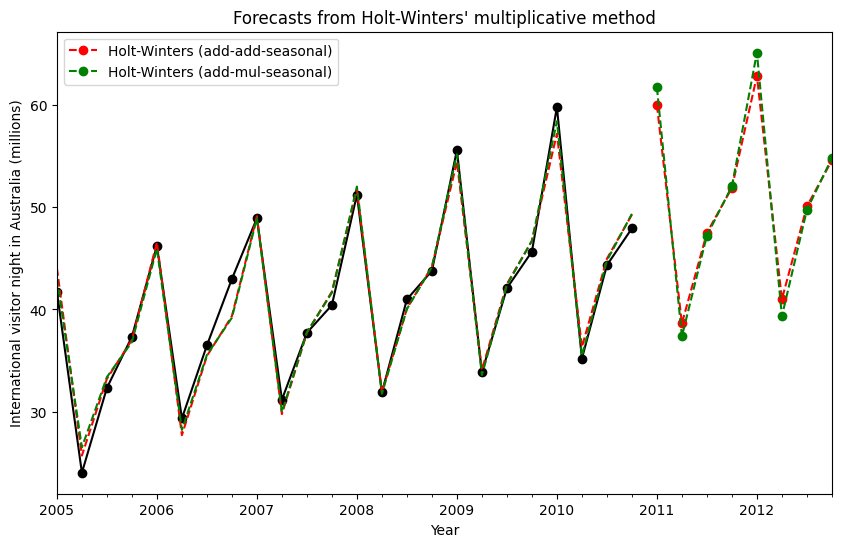
Figure 7.6: Forecasting international visitor nights in Australia using Holt-Winters method with both additive and multiplicative seasonality.
[8]:
| 加性 | 乘法 | 加性阻尼 | 乘法阻尼 | |
|---|---|---|---|---|
| $\alpha$ | 1.490116e-08 | 1.490116e-08 | 1.490116e-08 | 1.490116e-08 |
| $\beta$ | 1.409865e-08 | 0.000000e+00 | 6.490845e-09 | 5.042120e-09 |
| $\phi$ | NaN | NaN | 9.430416e-01 | 9.536043e-01 |
| $\gamma$ | 7.066690e-16 | 1.514304e-16 | 1.169213e-15 | 0.000000e+00 |
| $l_0$ | 1.119348e+01 | 1.106382e+01 | 1.084022e+01 | 9.899305e+00 |
| $b_0$ | 1.205396e-01 | 1.198963e-01 | 2.456750e-01 | 1.975449e-01 |
| SSE | 4.402746e+01 | 3.611262e+01 | 3.527620e+01 | 3.062033e+01 |
內部機制
可以獲取指數平滑模型 的內部機制。
在這裡,我們展示一些表格,讓您可以並排查看原始值 \(y_t\)、層級 \(l_t\)、趨勢 \(b_t\)、季節性 \(s_t\) 和擬合值 \(\hat{y}_t\)。請注意,如果擬合是在沒有 Box-Cox 轉換的情況下執行的,則這些值僅在原始數據空間中具有有意義的值。
[9]:
fit1 = ExponentialSmoothing(
    aust,
    seasonal_periods=4,
    trend="add",
    seasonal="add",
    initialization_method="estimated",
).fit()
fit2 = ExponentialSmoothing(
    aust,
    seasonal_periods=4,
    trend="add",
    seasonal="mul",
    initialization_method="estimated",
).fit()
[10]:
df = pd.DataFrame(
    np.c_[aust, fit1.level, fit1.trend, fit1.season, fit1.fittedvalues],
    columns=[r"$y_t$", r"$l_t$", r"$b_t$", r"$s_t$", r"$\hat{y}_t$"],
    index=aust.index,
)
forecasts = fit1.forecast(8).rename(r"$\hat{y}_t$").to_frame()
df = pd.concat([df, forecasts], axis=0, sort=True)
[11]:
df = pd.DataFrame(
    np.c_[aust, fit2.level, fit2.trend, fit2.season, fit2.fittedvalues],
    columns=[r"$y_t$", r"$l_t$", r"$b_t$", r"$s_t$", r"$\hat{y}_t$"],
    index=aust.index,
)
forecasts = fit2.forecast(8).rename(r"$\hat{y}_t$").to_frame()
df = pd.concat([df, forecasts], axis=0, sort=True)
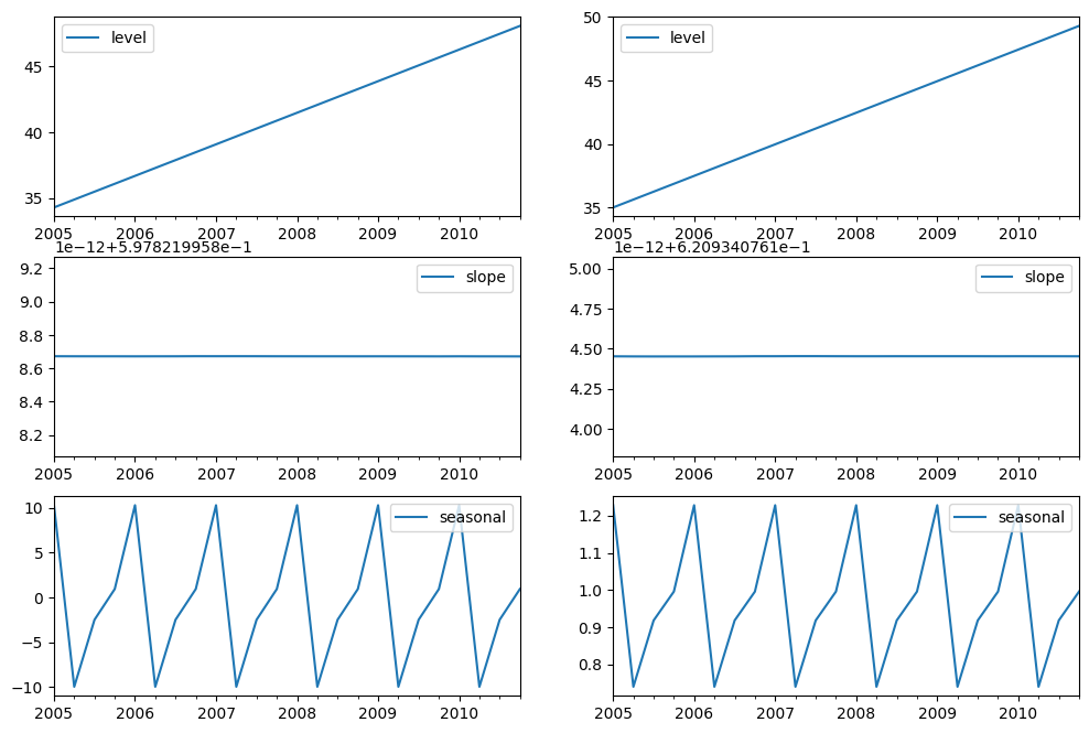
最後,讓我們看看模型的層級、斜率/趨勢和季節性分量。
[12]:
states1 = pd.DataFrame(
    np.c_[fit1.level, fit1.trend, fit1.season],
    columns=["level", "slope", "seasonal"],
    index=aust.index,
)
states2 = pd.DataFrame(
    np.c_[fit2.level, fit2.trend, fit2.season],
    columns=["level", "slope", "seasonal"],
    index=aust.index,
)
fig, [[ax1, ax4], [ax2, ax5], [ax3, ax6]] = plt.subplots(3, 2, figsize=(12, 8))
states1[["level"]].plot(ax=ax1)
states1[["slope"]].plot(ax=ax2)
states1[["seasonal"]].plot(ax=ax3)
states2[["level"]].plot(ax=ax4)
states2[["slope"]].plot(ax=ax5)
states2[["seasonal"]].plot(ax=ax6)
plt.show()
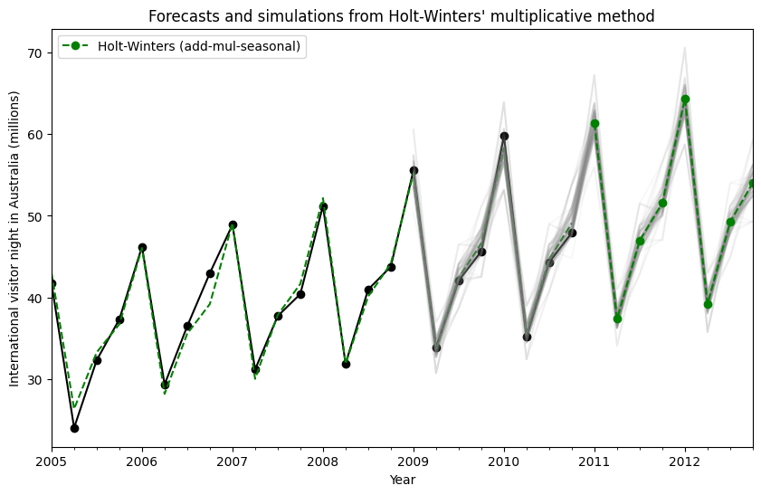
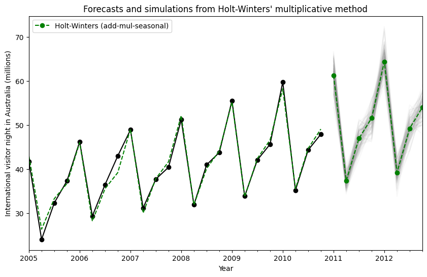
模擬和信賴區間
通過使用狀態空間公式,我們可以執行未來值的模擬。數學細節在 Hyndman 和 Athanasopoulos [2] 以及 HoltWintersResults.simulate 的文件中進行了描述。
與 [2] 中的範例類似,我們使用具有加性趨勢、乘法季節性和乘法誤差的模型。我們模擬未來最多 8 個步驟,並執行 1000 次模擬。如下圖所示,模擬與預測值非常吻合。
[13]:
fit = ExponentialSmoothing(
    aust,
    seasonal_periods=4,
    trend="add",
    seasonal="mul",
    initialization_method="estimated",
).fit()
simulations = fit.simulate(8, repetitions=100, error="mul")

ax = aust.plot(
    figsize=(10, 6),
    marker="o",
    color="black",
    title="Forecasts and simulations from Holt-Winters' multiplicative method",
)
ax.set_ylabel("International visitor night in Australia (millions)")
ax.set_xlabel("Year")
fit.fittedvalues.plot(ax=ax, style="--", color="green")
simulations.plot(ax=ax, style="-", alpha=0.05, color="grey", legend=False)
fit.forecast(8).rename("Holt-Winters (add-mul-seasonal)").plot(
    ax=ax, style="--", marker="o", color="green", legend=True
)
plt.show()
模擬也可以在不同的時間點開始,並且有多種選項可選擇隨機雜訊。
[14]:
fit = ExponentialSmoothing(
    aust,
    seasonal_periods=4,
    trend="add",
    seasonal="mul",
    initialization_method="estimated",
).fit()
simulations = fit.simulate(
    16, anchor="2009-01-01", repetitions=100, error="mul", random_errors="bootstrap"
)

ax = aust.plot(
    figsize=(10, 6),
    marker="o",
    color="black",
    title="Forecasts and simulations from Holt-Winters' multiplicative method",
)
ax.set_ylabel("International visitor night in Australia (millions)")
ax.set_xlabel("Year")
fit.fittedvalues.plot(ax=ax, style="--", color="green")
simulations.plot(ax=ax, style="-", alpha=0.05, color="grey", legend=False)
fit.forecast(8).rename("Holt-Winters (add-mul-seasonal)").plot(
    ax=ax, style="--", marker="o", color="green", legend=True
)
plt.show()